Year 13 music videos - Jacob Dickens 4050
Thursday, 31 March 2011
EVALUATION: How did you use media technologies in the construction and research, planning and evaluation stages?
EVALUATION: What have you learned from your audience feedback?
From my audience feedback I learnt more about the genre that I chose and it helped me make vital decisions in how to make my music video and my ancillary tasks should look, for instance Jack Holmes suggested that because of the style of the music and the plans for the video that I should change the heads of the band members into something slightly more weird, which I did, replacing the band members with a biscuit, a fox and a skull.

EVALUATION: How effective is the combination of your main product and ancillary texts?
I think that my ancillary and main product (music video) are a very effective combination, they complement each other well as the all tie into each other, the people in the video with the animal heads etc. also appear on both the digipack and the advert, and the pictures that the person in the video held up also appear on the digipack. They all have the same kinds of theme, for instance both the video and the digipack are set in a light area.
EVALUATION: In what ways does your media product use, develop or challenge forms and conventions of real media products?
There was one main way in which that I my music video conformed to the typical conventions of a music video is that it has several shots where the entire band is shown playing the song, this is a typical thing to do in music videos of my genre.

My advert also conformed to what the normal view of a magazine advert for an album would look like, it was simple but gave all the information which was needed.

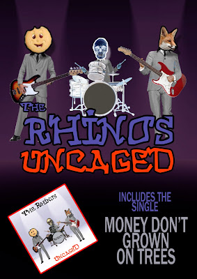
FINAL PRODUCT: Ancillary Product - Advert

Sunday, 13 February 2011
CONSTRUCTION: Advert
I constructed the advert using adobe photoshop. The page layout is A4 portrait (210mmx297mm) set for print at 300 dpi.
The advert is based on lots of adverts i found through my research in music magazines of the same genre.
Here is an example of the look i was going for.
To create the background I took the studio setting used in the video, inverted the colours in photoshop, and added a deep blue/purple tint to it.

I then added images of the band to the top half of the page and inverted the colours of the drummer to give him a colour negative appearance.
I then added the ‘The Rhinos’ band logo and the ‘Uncaged’ album name to the central portion of the image. Shrinking the ‘the’ to make the logo look more balanced.

I then pasted an image of the cd cover onto the bottom left hand corner of the page, tilting it slightly to make it look more interesting, and using a layer effect to put a red outline around it to make it stand out.

